
A Brand Jungle case study — built end to end
HARMONYINVESTMENTS
Zero brand. Zero product. Zero systems. In one build, we took Harmony from nothing to a fintech company that looks — and runs — like one: identity, website, app, and the operations behind all of it.
01 — The Challenge
A fintech company with nothing to show for it.
Harmony Investments was at an early stage and needed a complete visual identity that could position the company professionally within the competitive fintech and blockchain industry. The challenge was to create a brand that felt modern, secure, and approachable — while also communicating concepts like financial freedom, trust, and innovation.
The company needed a cohesive digital presence that could connect with potential investors and users across multiple platforms while standing out visually in a highly saturated market.
That went beyond the mark itself. Harmony had no website to send a first-time investor to, no app to show what the product would actually feel like to use, and no internal system to run the business — client conversations, passwords and team communication were scattered across disconnected tools.
No visual identity
Nothing distinct enough to stand out in a fintech market saturated with the same blues and the same sans-serifs.
No digital presence
No website and no app — nowhere for an investor to land, and nothing to show what the product feels like.
No operational backbone
Client contact, passwords and team communication spread across disconnected tools with no single home.
02 — The Solution
One system, built end to end.
At Brand Jungle, we worked closely with the Harmony Investments team to develop a complete branding and digital design system tailored to their goals and audience.
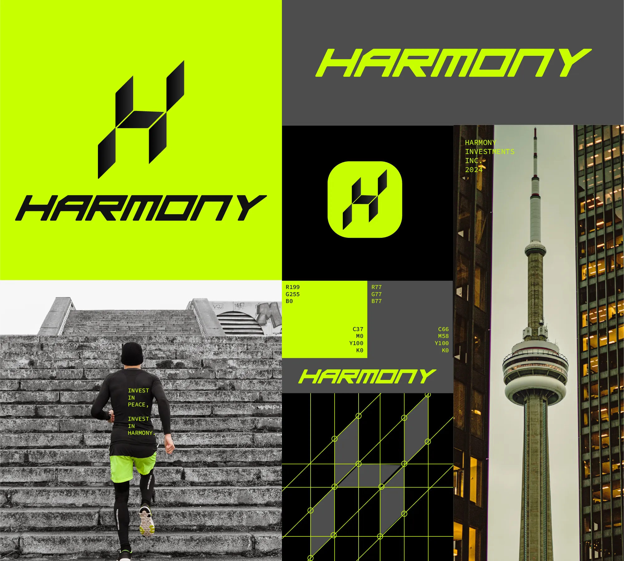
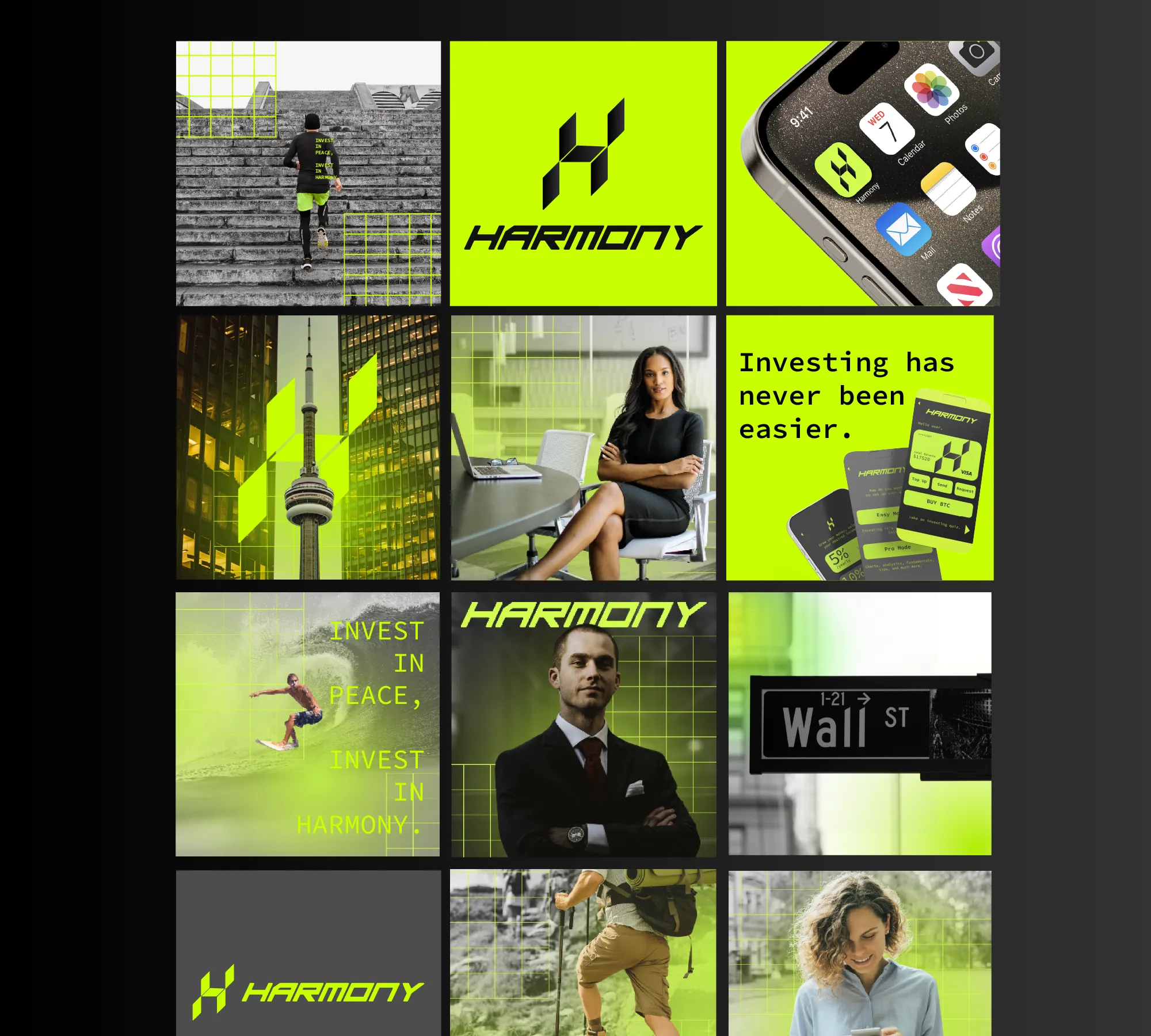
The project started with the creation of a geometric logo inspired by the strength and security of blockchain technology. We developed a refined visual identity using a carefully selected palette of green, black and dark gray tones to reinforce trust, professionalism and stability.
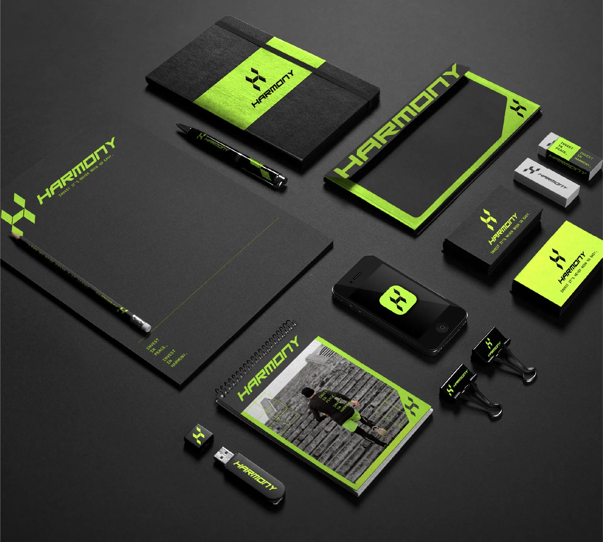
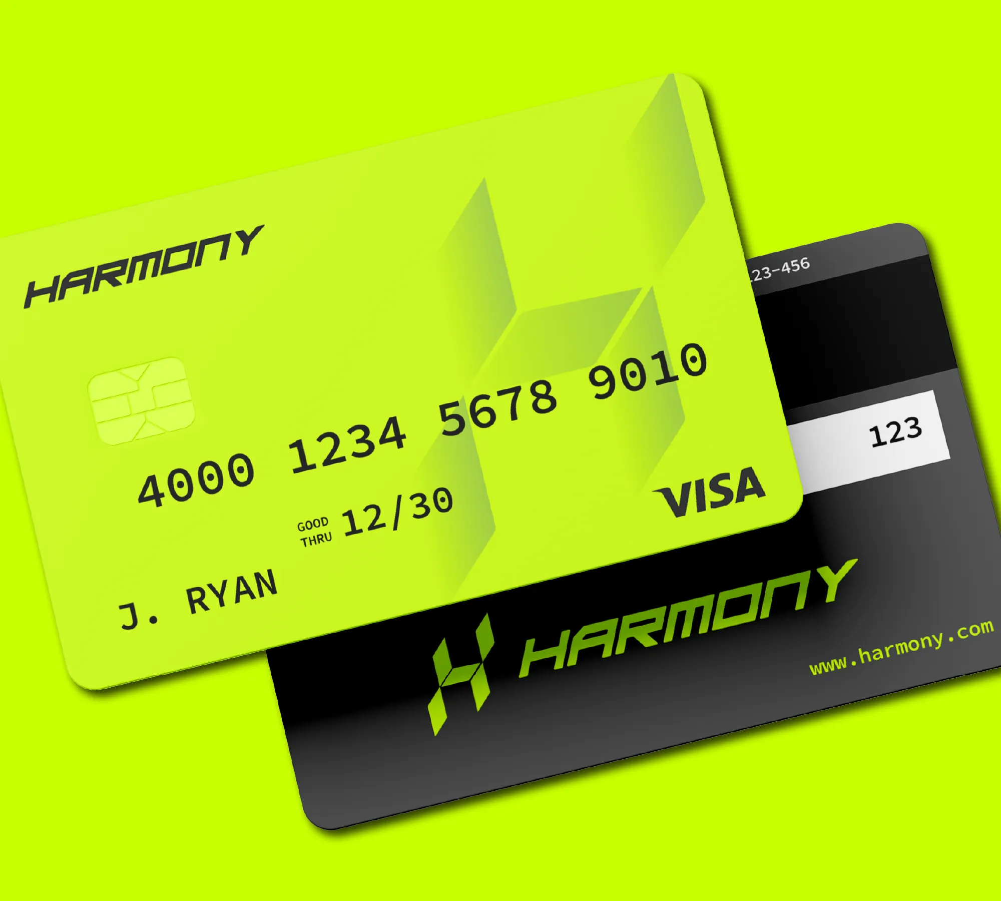
From there, we expanded the project into a full brand ecosystem including website design, social media content, advertisement graphics, stationery, and custom credit card concepts. We also created a UX/UI proposal for their future mobile app experience.
The creative direction focused heavily on the concept of financial freedom. Through lifestyle-oriented visuals inspired by surfing, hiking and outdoor activities, the brand communicates the idea that Harmony Investments handles your finances so you can focus on living freely.
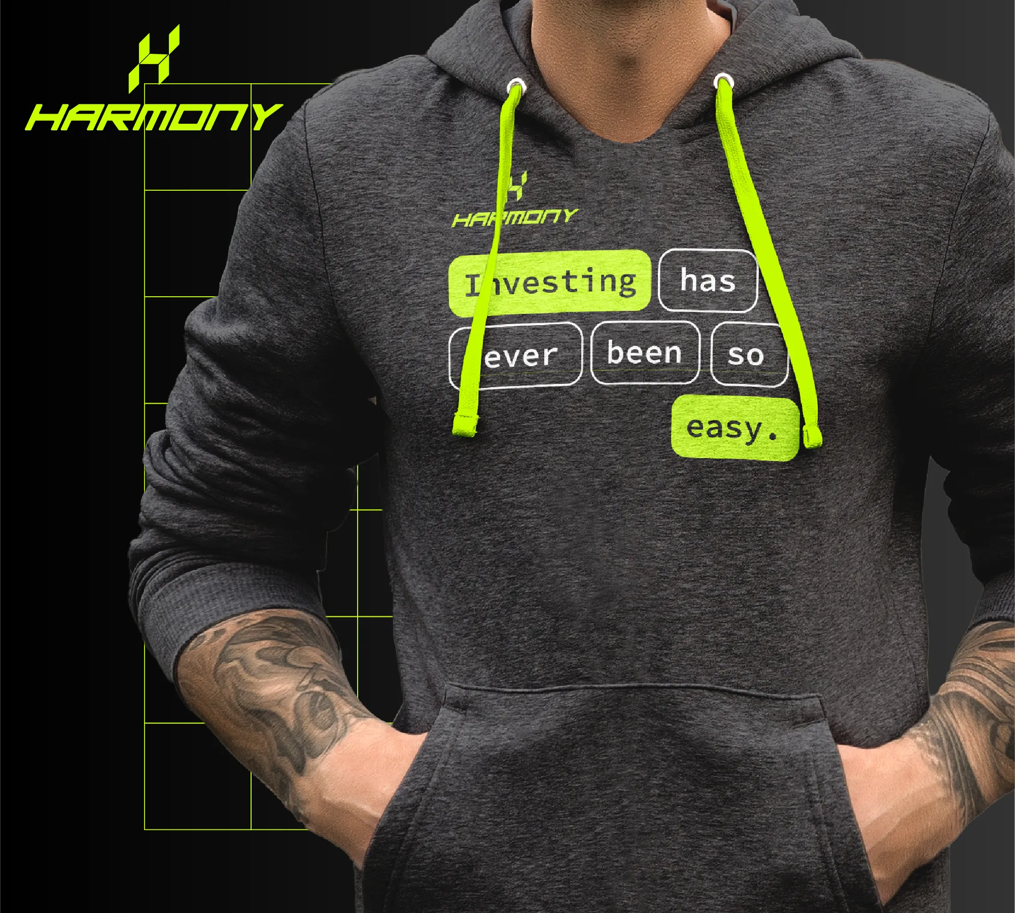
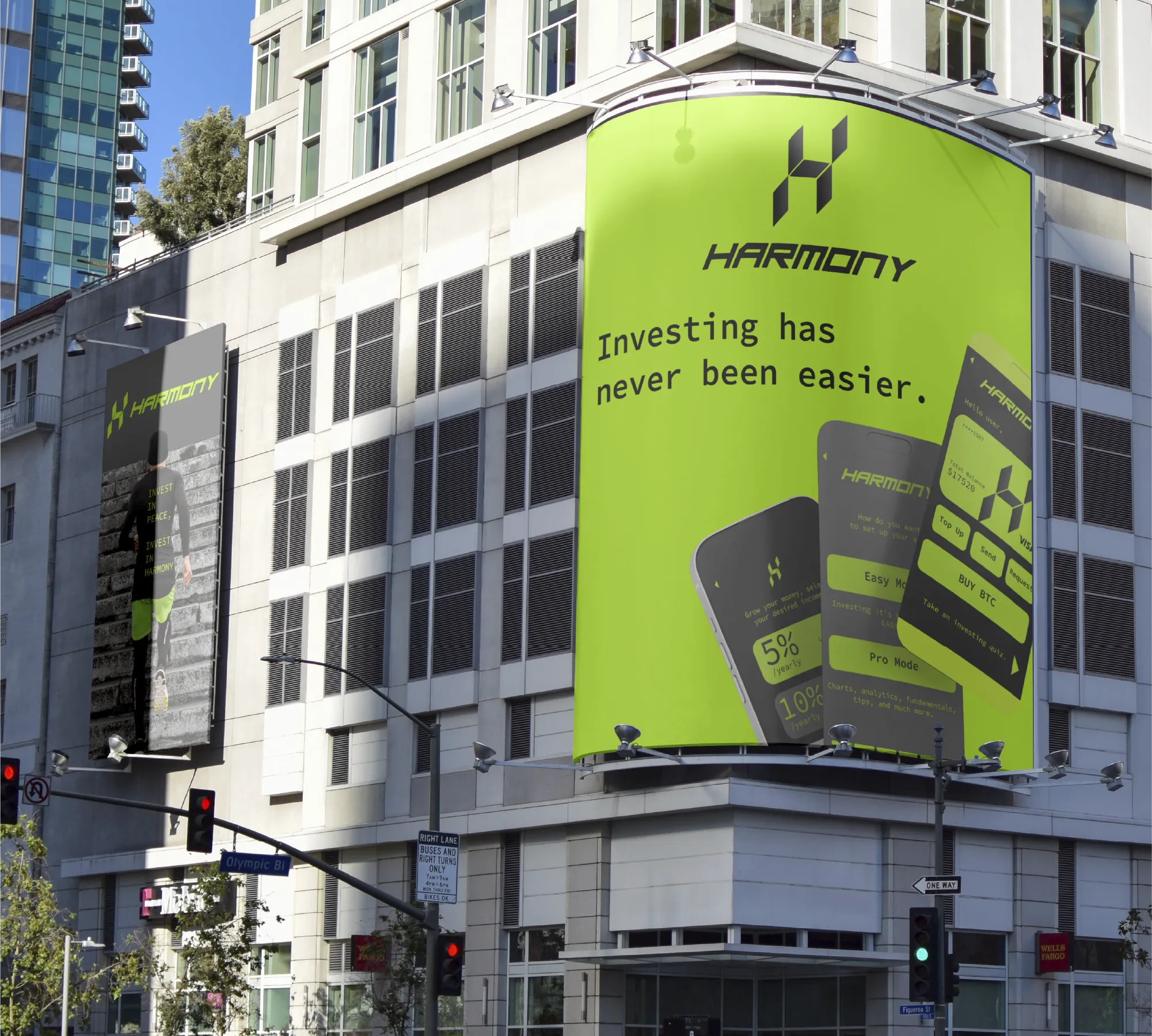
To strengthen the messaging, we developed slogans such as "Investing has never been easier" and "Invest in peace, invest in Harmony" to align with the company's mission and values.
The Identity
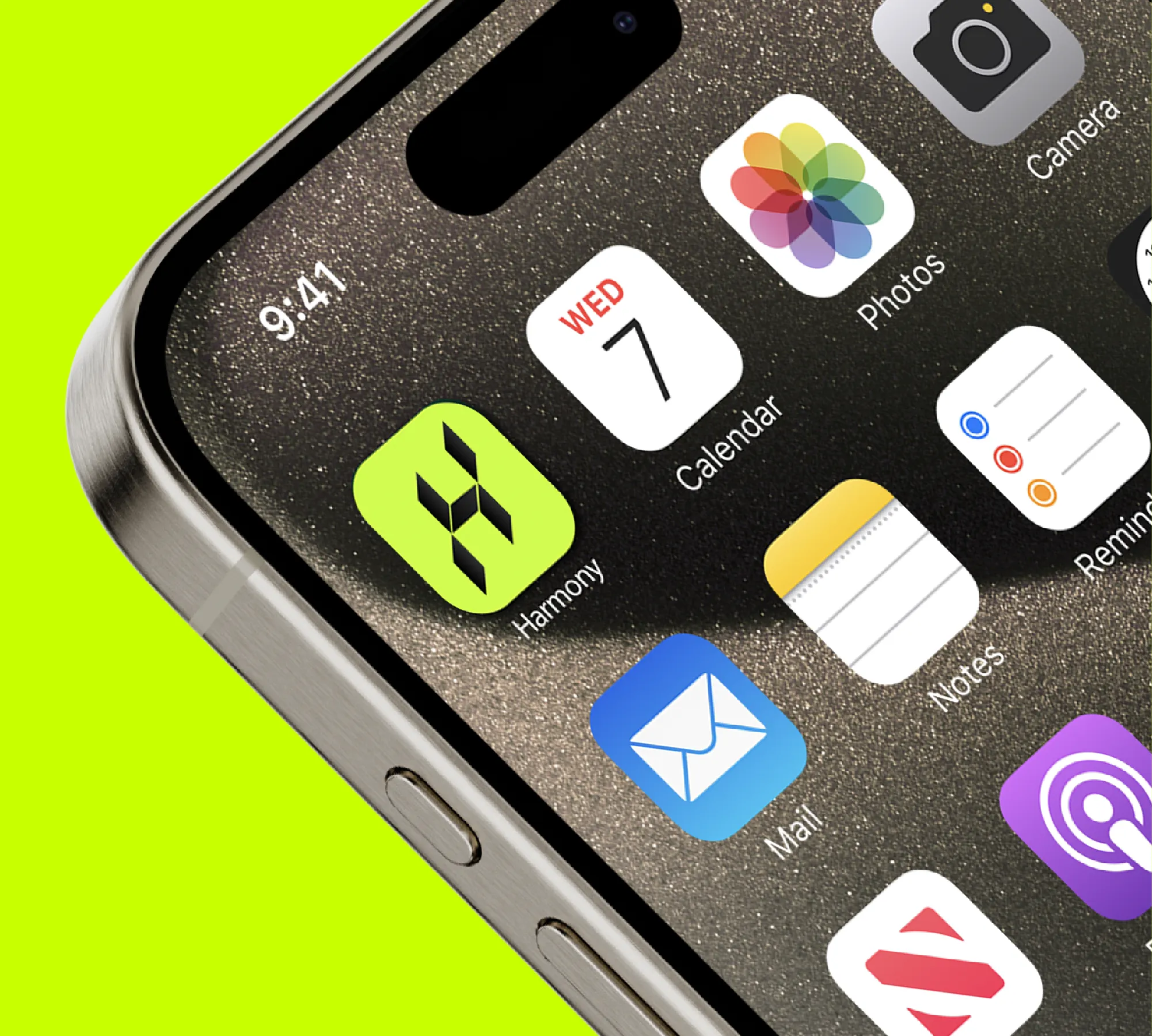
A mark built for a phone icon and a building facade.
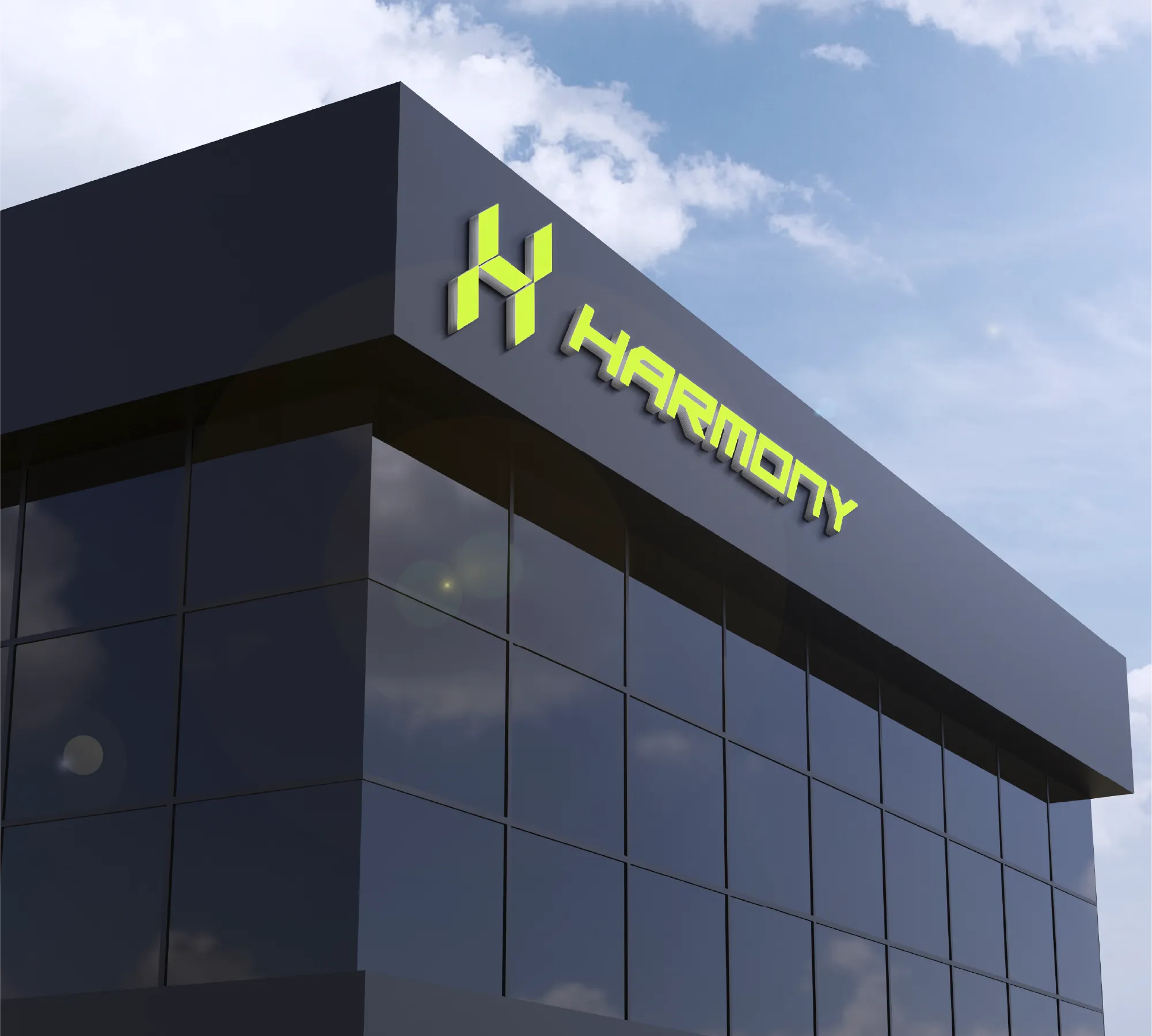
Harmony's mark is a single isometric "H" — built from flat planes so it reads as a cube from the front and a monogram from the side. It has to work as a 16px favicon and a lit sign on a building facade, without losing legibility at either extreme.
Around it: an angular, engineered wordmark, and a lime-on-black system that reads as fintech rather than "safe corporate blue."

The Website
A homepage that behaves like the product it sells.
Watch it build itself as you scroll: the grid locks onto the runner like live market analysis, and the copy types itself in — right where a ticker would sit on any other fintech screen.

On track — rebalanced automatically every month.
Full depth: order book, moving averages, fundamentals, alerts.
INVEST IN PEACE, INVEST IN HARMONY.
The nav, the ticker-style typewriter copy, and the analysis grid over the hero photo are all live in the browser — not a screenshot. The homepage keeps scrolling inside the frame above as you scroll the page, exactly like the real site will.
Below the fold: an Easy Mode / Pro Mode split for two very different kinds of investor, a one-account-every-market pitch for the app, and a footer that quietly credits the team that built it.
The Product
Eight screens. One system.
From the splash screen to a live-looking BTC ticker, every screen shares the same type, spacing and motion rules as the mark itself. The buttons below react on click — they highlight in lime, just like a real selection state — even though this is a design sketch, not a working app.
HARMONYHow do you want to invest?
Hello, JoseRebalanced automatically · monthly
Increase contributionThe Operations
Everything Harmony runs on, in one dashboard.
Built by Brand Jungle as part of BrandJungle System: one hub replacing six disconnected tools — the website, analytics, passwords, client contact, an AI assistant, and the team itself. Click a section on the left.
Harmony InvestmentsWebsite
Live, hosted and monitored — edit copy or ship a new section without a developer.
Analytics
Website and app performance, in one read — no separate login required.
Password manager
Every login the business depends on, shared with the right people only — never in a group chat.
Client chat
Every investor conversation lands here — nothing gets lost in a personal inbox.
AI chatbot
First-line support for common questions, trained on Harmony's own docs — humans handle the rest.
Team communications
Internal channels for the Harmony team, separate from client conversations.
Meeting room
One link, on the brand's own domain — no scattered calendar invites.
Weekly product sync
Brand asset creator
On-brand assets generated in seconds — AI drafts, the team decides.
Social post
Ad banner
Business card
03 — The Results
From zero to a company that looks like one.
- A mark and system confident enough to sit next to any bank or exchange, without borrowing their visual language.
- A homepage that sells the product's ease before a single feature is explained.
- An app sketched screen-by-screen in the same type, spacing and motion rules as the mark.
- One operations hub — website, analytics, passwords, chat, AI and the team — instead of six logins.
Built by Brand Jungle
This is what "from zero" looks like when one team builds the whole thing.
Brand, website, app direction and the operations system — designed and shipped by Brand Jungle, end to end, for a client that started with nothing.