Chapter I
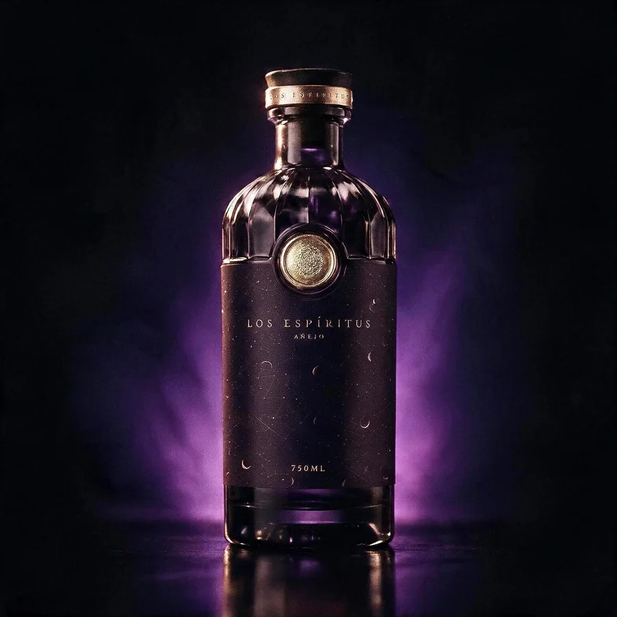
Añejo
Aged 8 years · Charred oak · 40% ABV
Dark cacao, tobacco leaf, dried fig and ember spice — the deep, unhurried voice of the collection.
Matte void-purple glass, gold spot-UV serpent.
Case study — Brand Jungle
We built
Brand · Packaging · Website · E-commerce · Ecosystem
A client came to us with three Caribbean rums and no brand. We built the whole thing — the identity, the packaging system, the gift box, the store and the social language — and this is how it went.
01 — The Challenge
Premium rum is a crowded category that sells itself the same way almost everywhere: gold medals, founder portraits, and the word premium repeated until it stops meaning anything. Los Espíritus needed to be picked up before it could be tasted — and picking up happens in about three seconds on a lit shelf.
The brief carried a real risk. The founding story is built on Caribbean folklore — the moon that times the harvest, the candle lit before a decision. Handled badly, that reads as costume mysticism: Halloween in a bottle, and a price point nobody believes.
There was also nothing to build on. No mark, no bottle system, no way to sell a single unit online, and three expressions that had to feel like one family without becoming interchangeable on the shelf.
02 — The Solution i. Identity
We wrote one distinction into the guidelines before drawing anything, and the whole system turns on it: reverence, not spectacle. Cormorant Garamond in italic carries the display voice — a serif that already looks like it is being said quietly. Cinzel handles the chapter markers. Jost keeps the body plain, so the sensory language does the work.
The gold invocation dot always follows the logotype. Never separated, never recoloured. It is the smallest rule in the book and the one that makes the mark legible at bottle scale.
Los Espíritus.
Cormorant Garamond · italic · medium
always set with the gold invocation dot
Display — Cormorant Garamond italic
Invoque The Spirits
Accent — Cinzel
Chapter I — The Elder Spirit
Body — Jost Light
Three expressions of Caribbean rum, distilled for those who believe the best moments are a little enchanted.
Iconography
Hand-drawn, single-weight line icons at 1.4px. Never filled solid — the imperfection in the line is deliberate, and it is what keeps the folklore honest instead of decorative.
02 — The Solution ii. Packaging
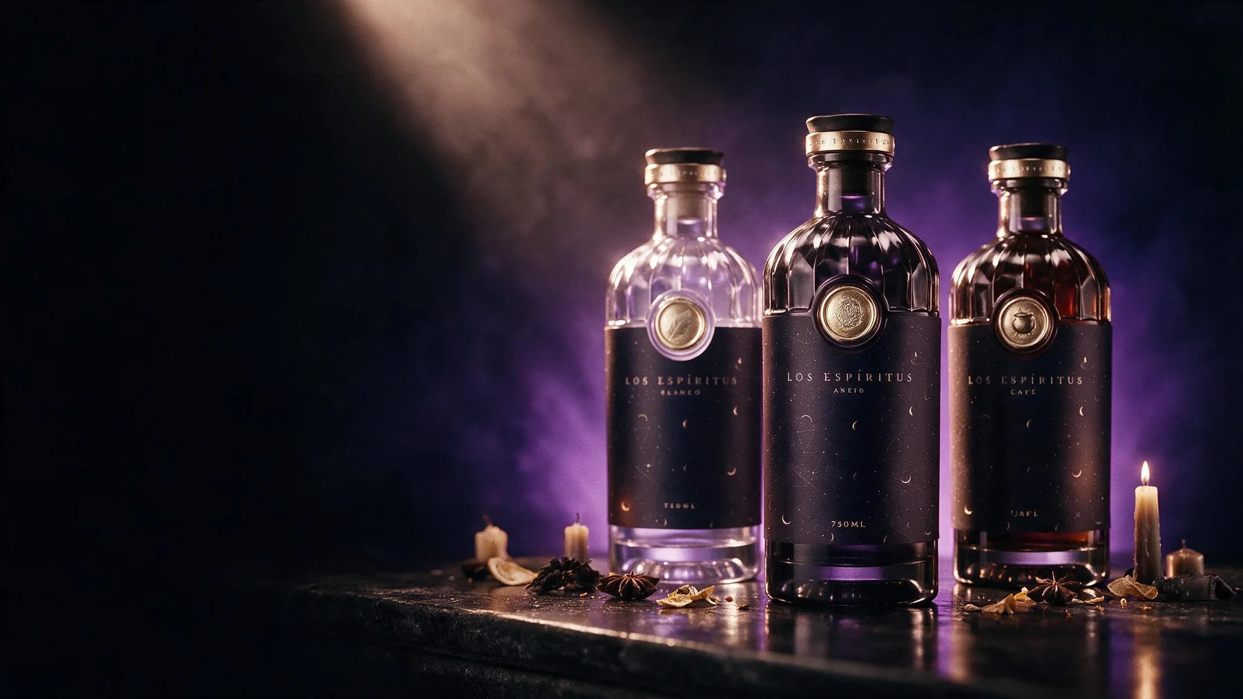
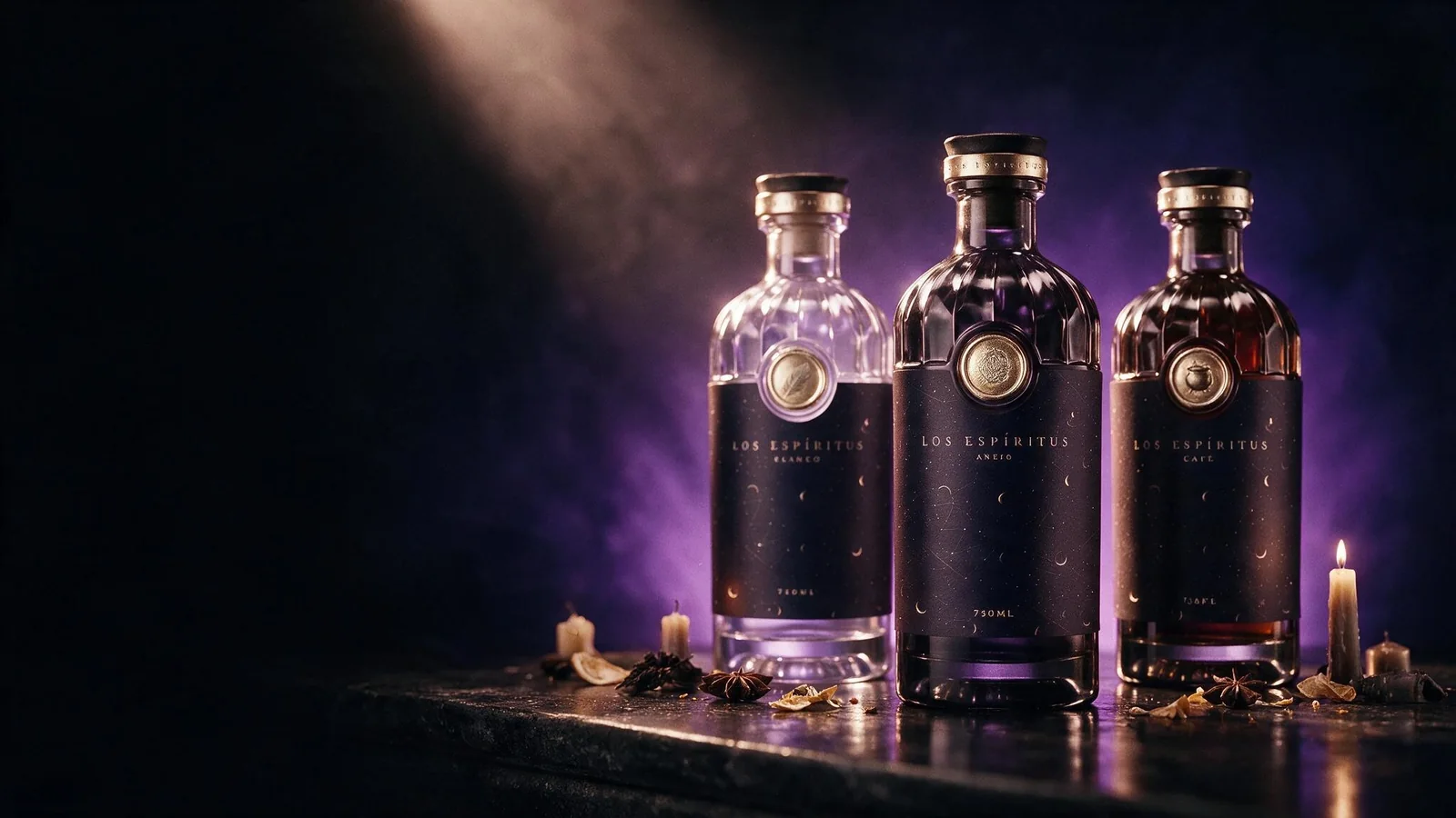
We finished every label with gold spot-UV that stays almost invisible under flat light and catches only when a candle — or a toast — is near. It is a retail decision before it is a romantic one: on a lit shelf the varnish is what separates the bottle from six matte competitors.
One glass silhouette across all three, so the collection reads as a family at two metres. The expression is carried by glass colour and by a single icon per chapter, which is what makes them distinguishable at arm's length.
Chapter I
Aged 8 years · Charred oak · 40% ABV
Dark cacao, tobacco leaf, dried fig and ember spice — the deep, unhurried voice of the collection.
Matte void-purple glass, gold spot-UV serpent.
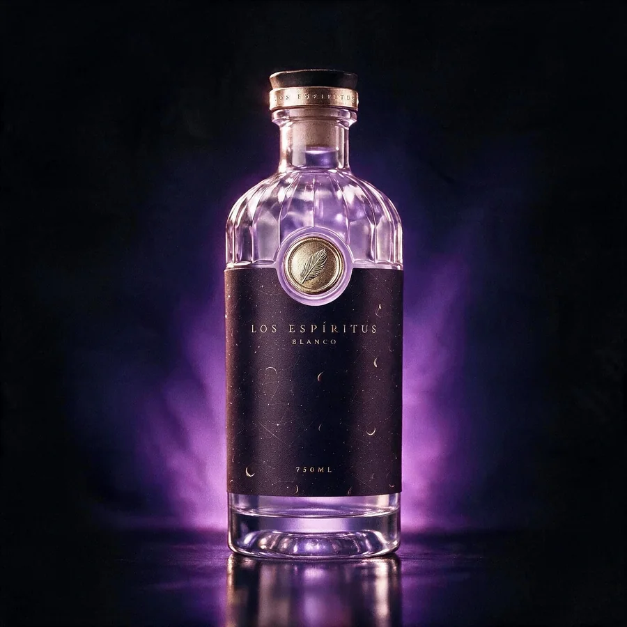
Chapter II
Triple filtered · Pure spirit · 38% ABV
Citrus blossom and sugarcane clarity. Charcoal-filtered to a whisper — the spirit before it takes a shape.
Matte void-purple glass, gold spot-UV feather.
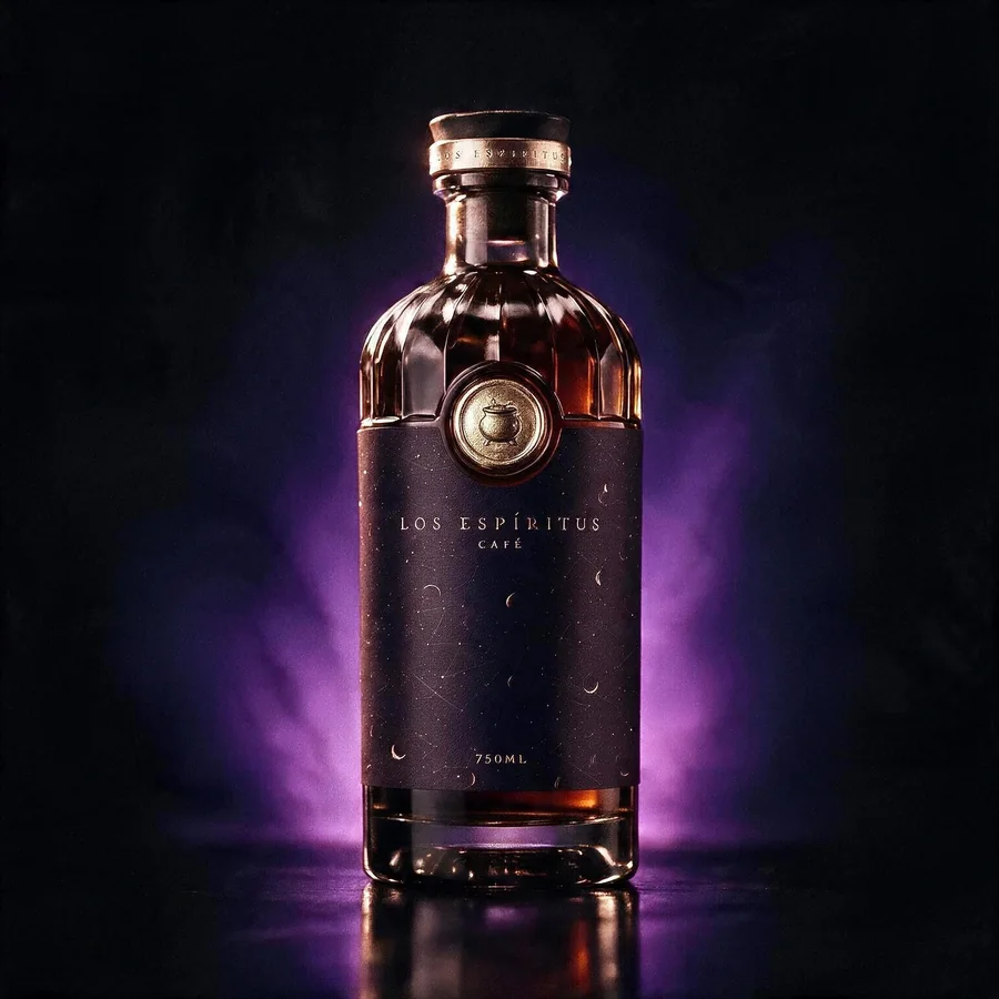
Chapter III
Slow brewed · Dark roast infusion · 35% ABV
Bittersweet coffee over velvet-dark rum, conjured slowly for the hour between night and morning.
Matte dark rum-brown glass, gold spot-UV cauldron.
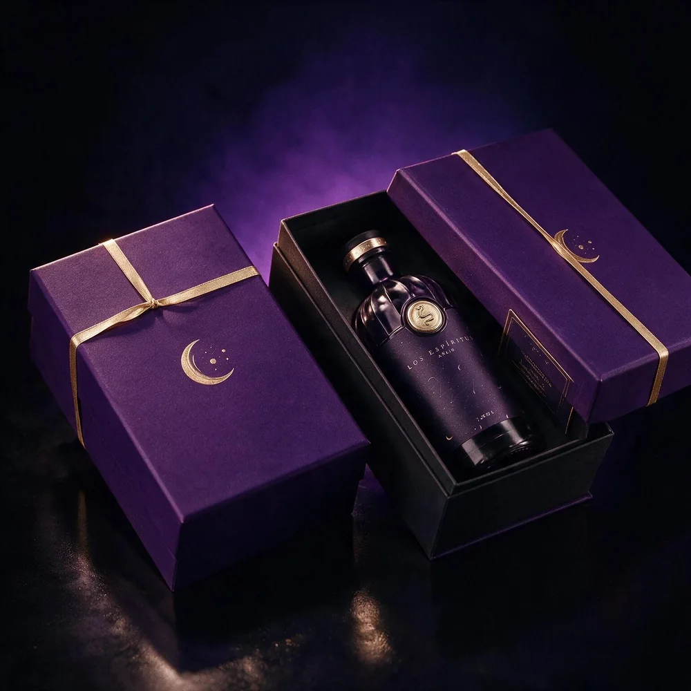
A gift box built like a small altar. Matte amethyst lid stamped with the crescent mark, a single gold ribbon closure, and a fitted interior for any one of the three expressions.
02 — The Solution iii. The store
We built the site as three chapters rather than a product grid, because the collection only makes sense read in order. Each expression gets its own passage before it gets a buy button — the brand's own rule, applied to the scroll.
Under the atmosphere it is a working shop: three SKUs, the gift box as a fourth path, and a trade enquiry route kept separate from consumer checkout so wholesale never lands in the same inbox.
Los Espíritus.
A Caribbean Ritual, Bottled
Three expressions of Caribbean rum, distilled for those who believe the best moments are a little enchanted. Los Espíritus is not simply poured — it is invoked.
Enter the collectionThe Ritual
Los Espíritus is not simply poured — it is invoked.
Contact Us
Stockists, private orders and gifting — tell us what you need and we answer within two days.
Write to usTrade enquiries are handled on a separate line.
02 — The Solution iv. Ecosystem
We closed the guidelines with a voice table — what to do and what never to do — because a spirits brand lives or dies on the caption under the bottle. Softly mystic, confident, sensory and specific. Never spooky, never jokey, never curated or elevated.
Social, retail collateral and the trade deck all draw from the same chapter structure, so a post and a shelf-talker are recognisably the same brand without repeating the same asset.
03 — The Results
Note for the founders: the figures above describe what was built and shipped. Commercial results — sell-through, stockists, direct revenue — are deliberately absent until you confirm real numbers. Send them and they go in.
Built by Brand Jungle
Identity, packaging and e-commerce under one roof — so the bottle on the shelf and the product page tell the same story, and both of them sell.
Heads up: the assistant isn't wired up yet. Your questions won't get a real answer in here for now.